Pantone Spring 2019 Report: Where and How to Use the Season’s Hottest Colors

Spring is in the air which means the latest color trends from the fashion influencers at Pantone will be appearing in designer clothing racks, glossy fashion magazines, and in interior finish products for homes and offices across the spectrum. We’ll see these colors on the runway later this year at NY Fashion Week but now is your chance to use them to spark inspiration in your home.
Since spring is also a time of rejuvenation many of us take this opportunity to jump into projects like a total interior make-over for one or more areas of the home. So, for a little inspiration, here are some cool links about incorporating this year’s hottest colors according to Pantone:
Happy and Fun-Loving
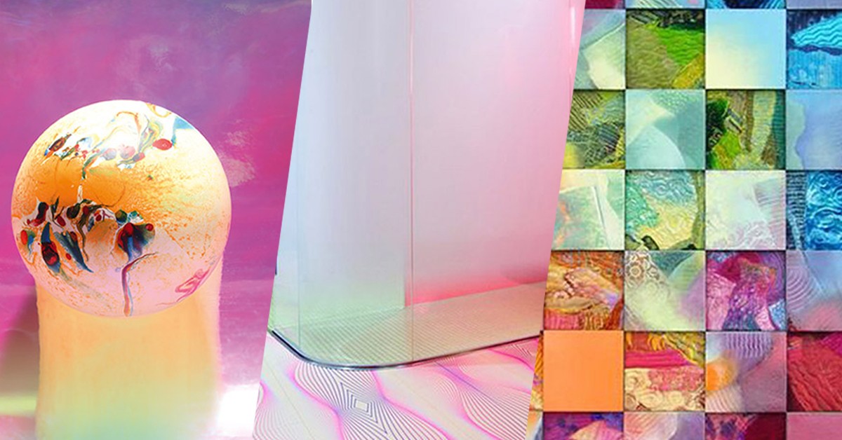
The bright and inviting themes are what instantly capture your imagination here. By choosing this range of colors Pantone’s aim was to develop “empowering colors that provide confidence and spirit.”
These colors would be eye-catching as an accent, a focal point or just about anything else you can think of. If you want to encourage good energy in your space, you can’t go wrong with these colors. Colors stir emotion, of course (that’s the whole point!), and this collection is thought to be alluring, adventurous and full of life.
Vivid Shades Expand a Space
Darker colors can be harder to decorate with because, if used too heavily, they can make a room feel cramped and or closed in. However, brighter colors achieve just the opposite effect and can create a sense of light and openness even in a small room.
Have a space that just feels too small? That can often be changed with just a coat of paint. Apply a shade like Living Coral (Pantone’s 2019 Color of the Year) or Sweet Lilac. These colors are nature-inspired; they’re fun, bright and they really will breathe life into uninspired spaces. And, with natural light sources, they will reflect even more energy and punctuate an otherwise ho-hum space.
If you want to go even bolder (do it!), choose any of the more flashy colors as the center of attention. Go with Turmeric, Pink Peacock, Aspen Blue or any other color that you’re drawn to as an accent color. We love it! If these are too bold for your walls, no prob, let ‘em shine through in throw pillows/blankets, carpet, furniture or art pieces in order to add dimension and interest.
Build off the Classics
This spring’s color lineup showcases 4 stylish neutrals that colors that you can use alone or as a foundation for a striking accent. They can mix and match with almost any other color in this palette.
These neutrals are versatile enough to be on-trend in any season, but they pair naturally with more bold accent colors so you can still make a statement. For example, if you’re looking for a playful yet refined vibe, you could sync the cool-toned Eclipse in your furniture with berry-colored Pink Peacock as an accent in an art piece, throw, or pillow. Or, if you’re after a more relaxed, spa-like space – gotta have that Zen – choose nature inspired Pepper Stem or Terrarium Moss type tones in the hardwood or resilient plank flooring for floors with Soybean or Sweet Corn as a wall color for balance. It doesn’t get any more calming than that!
You could also spice up the space with Turmeric or Mango Mojito as an accent to Eclipse. The bright marigold shades will add an eased visual contrast to a cool-toned or darker foundation. Together, they create a moody yet inviting combination that can transform a variety of spaces.
Ready to infuse your spaces with the most exciting colors of 2019? We can help by bringing an array of samples to your home so that you select the perfect floor! Call 317-879-TISH (8474) for your FREE in-home estimate today!

