Use New York Fashion to Help Your Home Spring to Life
With spring right around the corner and New York Fashion Week recently wrapping up, we are all about new trends this month. Every year, iconic designers and influencers showcase the styles that will shape fashion trends for the entire year. If you’re into style this is your Super Bowl season.
But, we aren’t just talking about envelope-pushing style for clothing and accessories unveiled on the runways in Manhattan. Ultimately, what is displayed there will at some point inform the flooring in your own hallways. Patterns and colors dreamed up by designers merge with the design of buildings, structures and interior furnishings and finishes as well.
With spring being a time of renewal, homeowners across the country will begin reimagining, redecorating and reinvigorating their homes. And they’ll be looking to the season’s most popular colors for direction and inspiration.
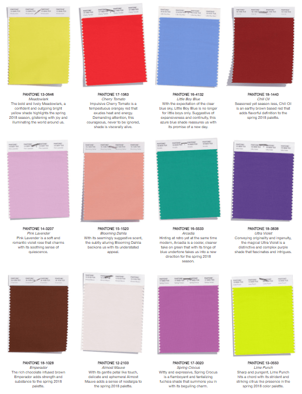
The fashion influencers at Pantone have revealed their picks for New York Fashion Week’s most fabulous colors. When models start hitting the runway, this is what they will be wearing – and their prognostications will resonate across both across apparel and furnishings industries and across the country.
Fun and Playful
The first thing you’ll notice with these colors is that heavy, dark tones are mostly out of favor. Pantone’s goal this year was to create a “kaleidoscopic bounty of uplifting shades.”
Using these colors in your home, whether it’s an accent, centerpiece or unifying element, you are making a statement: only positive vibes allowed in this house! Thematically, the tone is inviting, bold and energetic.
Bright Colors Open Up a Room
Dark colors absorb light and can make even a large area feel small. Lighter colors, on the other hand, reflect light; lighter colors create volume and space.
Have a room (or two) that just feels cramped? It’s time for a fresh coat of paint! Use one of this spring reports’ more neutral colors like Blooming Dahlia or Almost Mauve. Either will infuse new energy into your space. These two are great base colors. Pull back window treatments, allow natural light to stream in, and watch the space transform.
Want to open it up even more? Use one or two of the bolder colors as focal points. Try using Chili Oil, Emperador, Ultra Violet (Pantone’s 2018 Color of the Year) or any other color that resonates with you as an accent wall. Incorporate these colors in pillows, rugs, carpet and furniture for extra splashes of color throughout.
Build off the Classics
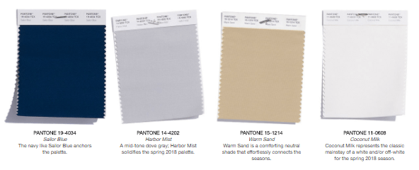
One color alone can work fine. But, like any dynamic duo (Robin and Batman? Sonny and Cher?) colors always work better with a partner. This spring report also includes 4 classic mainstay colors that can work all year in any room. They also just happen to be perfect pairings for any color on the list.
Using one of these colors as the foundation for your home the rest of the year, mix and match different colors in each room to give each space its own character.
Pair cooler tones like Little Boy Blue, Arcadia or Pink Lavender with Sailor Blue towels or Coconut Milk tile in your master bathroom for a relaxing dreamscape.
Spicier, more vibrant tones like Meadowlark or Cherry Tomato are the perfect pairing for Warm Sand tile, countertops, cabinets or laminate flooring in your kitchen for a space that energizes and uplifts.
From the runways of New York to your hallway, if you’ve got a color inspiration for your home, let Tish Flooring help bring it to life. Call 317-879-TISH (8474) today and we’ll bring samples to you.
[su_tile_flooring_guide]


