Pair Unexpected Colors to Spice Up Your Décor
Beige, Classic Ivory, Alabaster, Queen Anne’s Lace. All names of paint colors from the white color spectrum. All shades of white, a tried and true choice for any room. It’s a non-offensive classic. But what else is it? Boring!
Life is too short to be lived in a room with minimal color. Why play it safe when the world is bursting with colors like Lemon, Eggplant, Sage, Raspberry, Slate and Coral? Adding a few non-traditional colors to your room’s palette greatly increases the visual appeal of a room.
Colors that are deeply saturated will make the biggest statements; we want colors that look dramatic, unexpected and a little shocking. Remember, when choosing to pair two colors, it’s all about balance. Don’t split the color difference 50/50; choose your primary color to decorate with overall and your secondary color for accents. Now, let’s get to the colors!
From Sherwin-Williams Paint Color Visualizer https://www.sherwin-williams.com/visualizer/
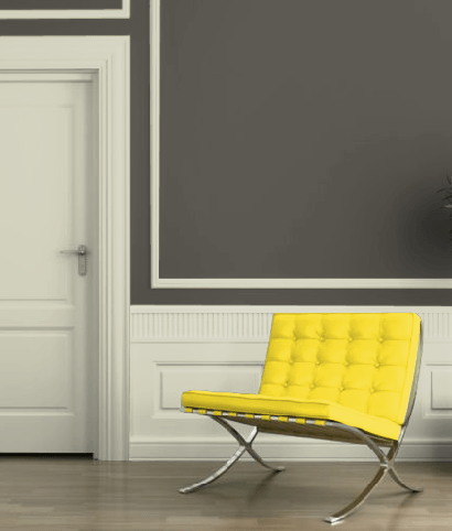
Charcoal Gray and Freesia
Gray is actually considered a neutral, even though it can come in very dark shades, because it goes with practically anything. But since we’re into mixing it up with bold, vibrant colors, freesia is a perfect choice. Instead of the gray coming off as gloomy, it’s suddenly the perfect backdrop for the bright burst of sunlight that is freesia.
From Sherwin-Williams Paint Color Visualizer https://www.sherwin-williams.com/visualizer/
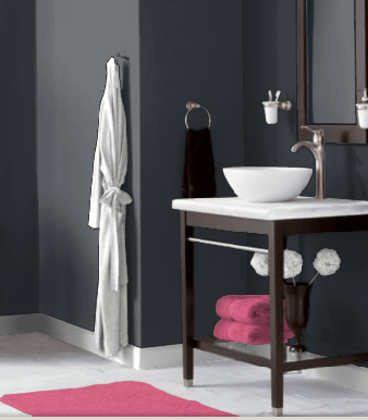
Slate Blue and Raspberry
Slate blue is a serious color. It’s a deeply moody blue, with a dark base, almost nearing navy but with more gray. This is why it should be paired with a fun color like raspberry.
From Sherwin-Williams Paint Color Visualizer https://www.sherwin-williams.com/visualizer/
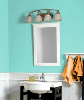
Seafoam and Burnt Orange
Orange and blue is not a color combination traditionally seen outside of football games. The traditional shades of classic blue and orange can be quite complementary when one is toned down. The blue is lightened into a nice blue/green combination that makes the burnt orange pop with an earthy-toned splash.
If you’re interested in finding even more unexpected color combinations, grab a color wheel. Choose colors you like from opposite sides of the color spectrum; find bright, saturated hues to pair with darker colors. Mix it up and have fun with it. Remember, you can make practically anything work as long as you stick true to your tastes.
If you need help choosing new flooring to go with your décor change, contact Tish Flooring. We offer home visits in Indianapolis, Noblesville and Fishers, and we bring samples along so you can see how they’d match your new color choices. Call to schedule a free consultation today!